
Guides
Kling Image 4.0 Poster Guide: Bilingual Text and Product Page Layout
When using Kling Image 4.0 to design a poster, what should the model letter and what should you typeset later? Keep essential copy editable, and use generated layouts as drafts for product pages.
Ethan Wang
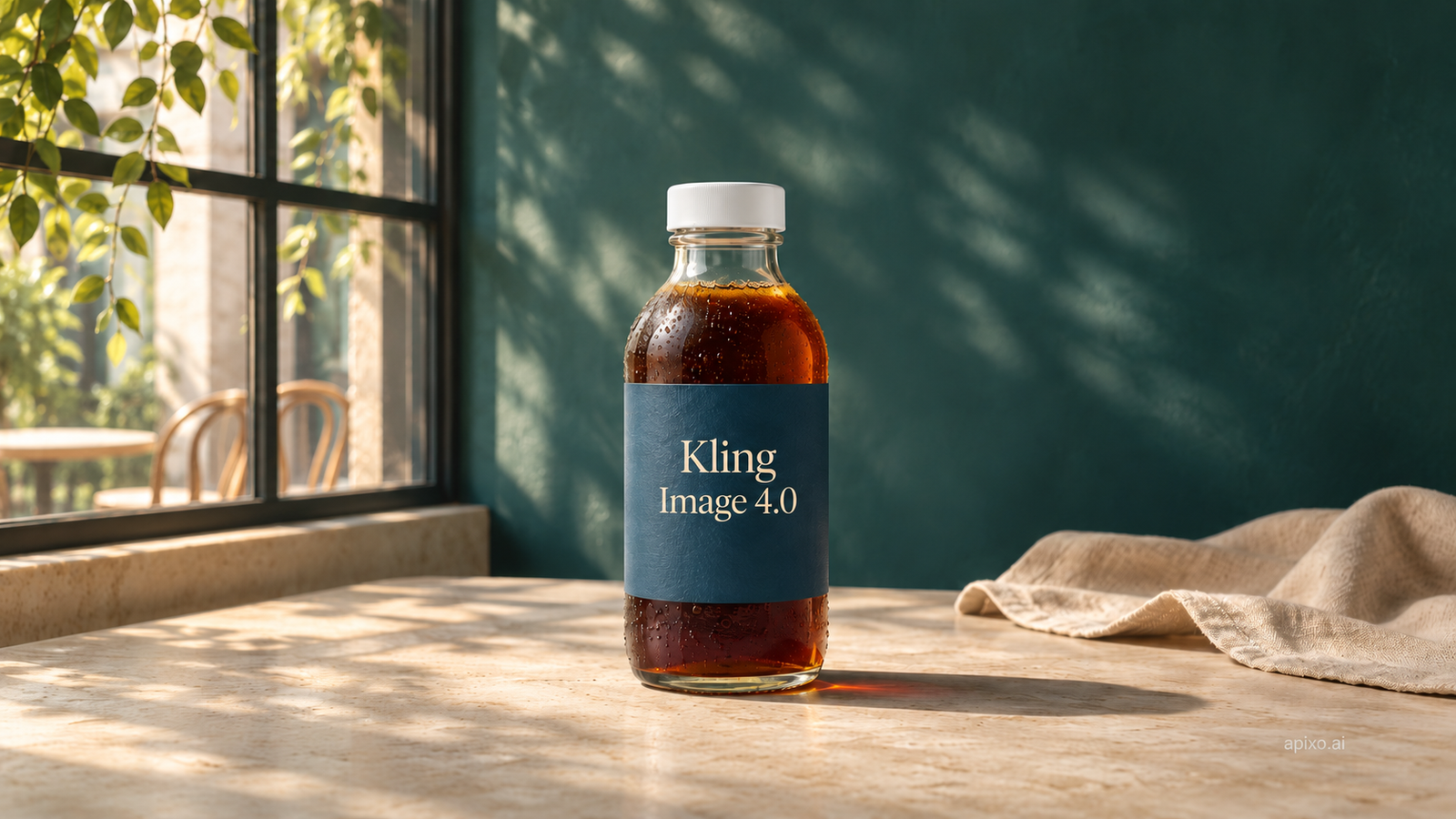
Use Kling Image 4.0 to create one product visual with room for a headline, then typeset the Chinese and English versions separately. Add dates, prices, and QR codes afterward so they’re easy to verify and update. Use a long image to plan the product page, then build the specifications and buy button on the page itself. If you’re preparing product photos, start with the workflow guide.
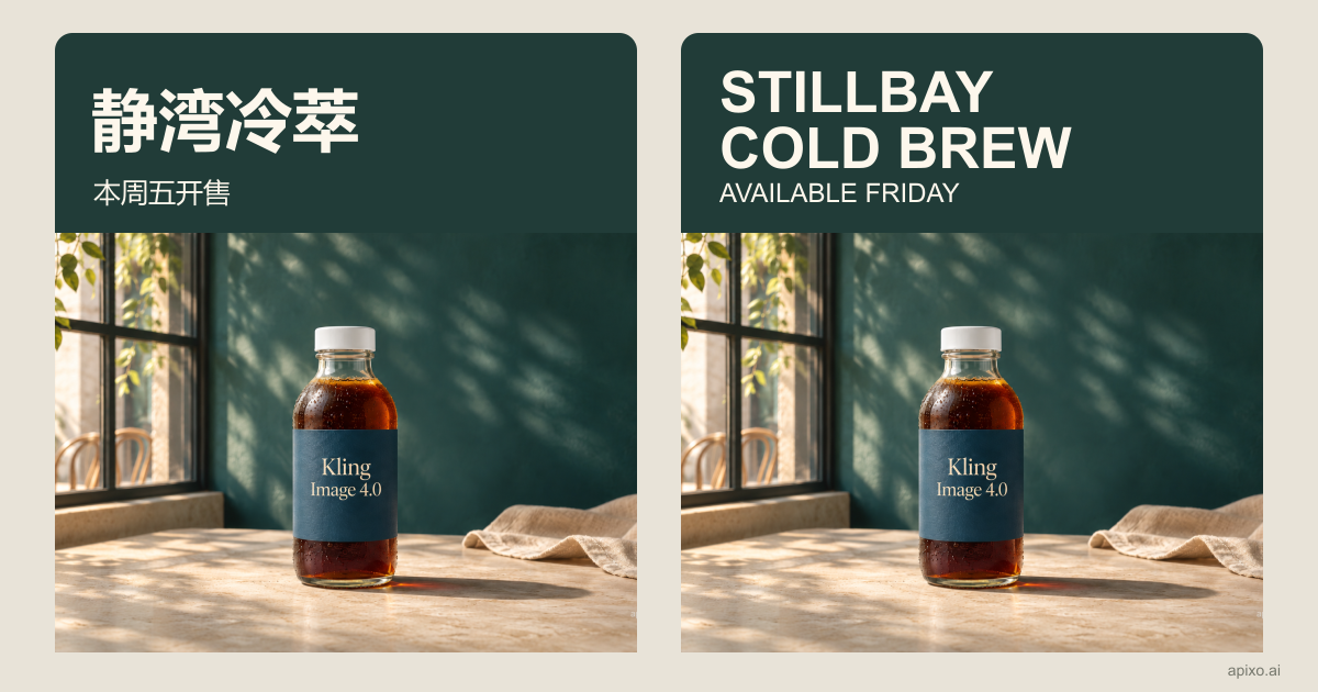
Editorial layout example: one line for the Chinese headline, two for English, with the launch line kept underneath.
Decide where the words belong
- Decorative headline for a concept — Generated lettering can work — Exact spelling and punctuation; readable at the intended size
- Launch date, price, promotion terms, or QR code — Editable type or a separately generated QR code — Compare against an approved source; scan the QR code
- Ingredients, specifications, shipping, and buying information — Real text on the product page — Selectable, readable on mobile, and consistent with the product system
Even if a model can letter the headline, keep it editable if it will change or be localized. Words baked into pixels cannot reflow or be updated independently like page text.
Create a multilingual poster from one clean visual
Imagine a launch for Stillbay Cold Brew. Make the background without campaign lettering, then typeset “STILLBAY COLD BREW / AVAILABLE FRIDAY” and the Chinese equivalent separately. Keep the bottle and visual hierarchy consistent, but let line breaks and font sizes adapt. A two-line headline is better than one line squeezed beyond legibility.
Copyable base-art brief:
Vertical cold-brew campaign visual. Keep the clear bottle, white cap,
and blue label from the product reference. Place the bottle in the
lower half. Leave a clean area above it for up to two lines of title
copy and a separate footer area. Avoid busy textures or glare there.
Add no campaign lettering, dates, prices, or QR codes. Do not redraw
the factual details already present on the packaging.
To try generated lettering, make a second concept with only the headline. Put the requested copy, generated concept, and editable version side by side. Check for missing or added words, punctuation, and line breaks. Shrink each version to phone width and review Chinese and English separately.
Compare both languages on the same artwork. Keep the bottle image, canvas, and information order fixed. Change the type size and line breaks: the Chinese headline can stay on one line while the English headline wraps to two. Keep the launch line underneath rather than over the bottle or down in the footer. This compares two editorial layouts, not two model generations.
Use a long product image to plan the page, not replace it
On the APIXO AI model page, choose Product Detail Page, upload your product photos, and generate a layout draft at 1K or 2K. Describe the sections in reading order.
Sketch four sections: hero, three verified selling points, a detail shot, and specifications or purchasing information. Use generated images to explore composition and art direction. Keep the final copy and purchase controls in page components, so a price change does not require a new image and a narrow screen can reflow the content.
Layout brief: Sketch a vertical cold-brew product page. Place the same bottle in the hero, leave three spaces for selling points below, include a bottle close-up, and reserve a section for specifications. Separate the sections with whitespace. Do not invent claims, labels, prices, or buttons.
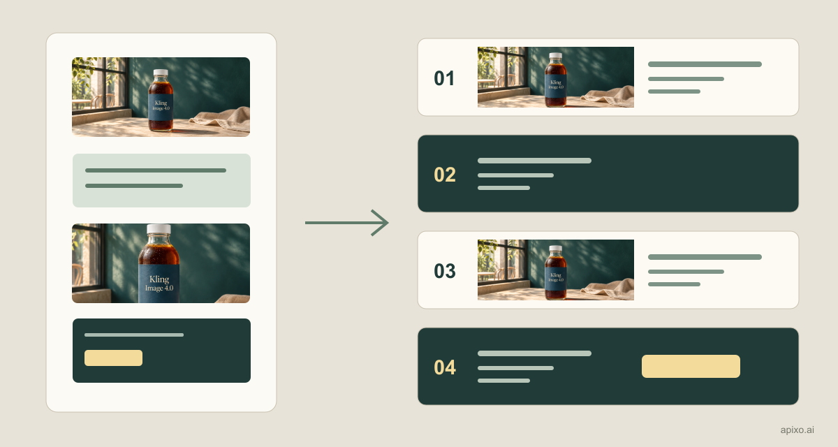
This is an editorial diagram, not a model test or a live storefront. Keep the product art in the hero and put the heading in real text. Use only approved facts in the benefit cards, export the detail image separately with alt text, and build specifications and buying controls as page components. Stack the benefit cards on narrow screens rather than shrinking the entire mockup. If promotion terms change, update that module without regenerating the hero.
Review it the way a shopper will see it
- At actual phone width, make sure the shopper can identify the product and read the headline.
- Compare every line with the approved copy. Check dates, currency, wrapping, and reading direction for each locale.
- Scan the actual QR code and click the real page button. A button drawn in a mockup does not work.
- Keep the clean art, editable text, and page copy as separate deliverables. Future price changes or translations should touch only the relevant layer.
The goal is not to fit the most text into one image. It is to make the offer readable, accurate, and easy to update.
Build with APIXO
Explore image, video, and audio models in one place.